반응형
기본적으로 제공하는 아이콘 다루기
import 'package:flutter/material.dart';
import 'package:week2_app/main.dart';
void main() => runApp(MyApp());
class MyApp extends StatelessWidget {
@override
Widget build(BuildContext context) {
return MaterialApp(
title: 'AppBar',
theme: ThemeData(primarySwatch: Colors.red),
home: MyPage(),
);
}
}
class MyPage extends StatelessWidget {
@override
Widget build(BuildContext context) {
return Scaffold(
appBar: AppBar(
title: Text("AppBar"),
centerTitle: true,
elevation: 0.0,
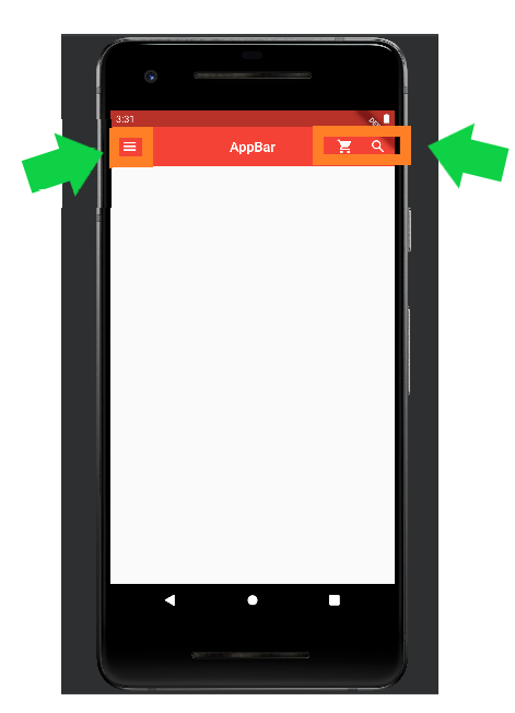
leading:
IconButton(icon: Icon(Icons.menu), onPressed: () => {print("hi")}),
actions: [
IconButton(
icon: Icon(Icons.shopping_cart),
onPressed: () => {print("hi22")}),
IconButton(
icon: Icon(Icons.search),
onPressed: () => {print("hi33")}),
],
),
);
}
}
기능 정리
- leading : 아이콘 버튼이나 간단한 위젯을 왼쪽에 배치할 때 사용하는 기능
- actions : 복수의 아이콘 버튼 등을 오른쪽에 배치할 때 사용하는 기능
- onPressed : 함수의 형태로 일반 버튼이나 아이콘 버튼을 터치했을 때 일어나는 이벤트를 정의하는 기능
Drawer 메뉴 만들기
import 'package:flutter/material.dart';
import 'package:week2_app/main.dart';

void main() => runApp(MyApp());

class MyApp extends StatelessWidget {
  @override
  Widget build(BuildContext context) {
    return MaterialApp(
      title: 'AppBar',
      theme: ThemeData(primarySwatch: Colors.red),
      home: MyPage(),
    );
  }
}

class MyPage extends StatelessWidget {
  @override
  Widget build(BuildContext context) {
    return Scaffold(
      appBar: AppBar(
        title: Text("AppBar"),
        centerTitle: true,
        elevation: 0.0,
        // leading:
        // IconButton(icon: Icon(Icons.menu), onPressed: () => {print("hi")}),
        actions: [
          IconButton(
              icon: Icon(Icons.shopping_cart),
              onPressed: () => {print("hi22")}),
          IconButton(
              icon: Icon(Icons.search), onPressed: () => {print("hi33")}),
        ],
      ),
      drawer: Drawer(
        child: ListView(
          padding: EdgeInsets.zero, // 여백은 필요 없다.
          children: [
            UserAccountsDrawerHeader(
              accountName: Text("yong"),
              accountEmail: Text("otrodevym@gmail.com"),
              currentAccountPicture: CircleAvatar(
                backgroundColor: Colors.white,
                backgroundImage: AssetImage('assets/images/1.jpg'),
              ),
              otherAccountsPictures: [
                // currentAccountPicture와 같은 형태지만 복수로 지정 가능
                CircleAvatar(
                  backgroundColor: Colors.white,
                  backgroundImage: AssetImage('assets/images/2.gif'),
                ),
                // CircleAvatar( // 복수가 되는지 테스트
                //   backgroundColor: Colors.white,
                //   backgroundImage: AssetImage('assets/images/2.gif'),
                // )
              ],
              onDetailsPressed: () => {
                // 더보기 화살표를 구현
                print("clicked")
              },
              decoration: BoxDecoration(
                  color: Colors.red[200],
                  borderRadius: BorderRadius.only(
                      bottomLeft: Radius.circular(40.0),
                      bottomRight: Radius.circular(40.0))), // 빨간 부분을 꾸미기 위한 기능
            ),
            ListTile(
              leading: Icon(Icons.home, color: Colors.grey[850],), // 화면의 첫 부분
              title: Text("Home"),
              onTap: () => {
                print("home!!")
              },
              trailing: Icon(Icons.add), // 화면의 끝 부분
            ),
            ListTile(
              leading: Icon(Icons.settings, color: Colors.grey[850],), // 화면의 첫 부분
              title: Text("Setting"),
              onTap: () => {
                print("Setting!!")
              },
              trailing: Icon(Icons.add), // 화면의 끝 부분
            ),
            ListTile(
              leading: Icon(Icons.question_answer, color: Colors.grey[850],), // 화면의 첫 부분
              title: Text("Q&A"),
              onTap: () => {
                print("Q&A!!")
              },
              trailing: Icon(Icons.add), // 화면의 끝 부분
            ),
          ],
        ),
      ),
    );
  }
}
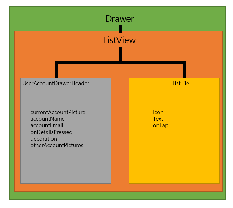
ListView란
- ListView는 복수의 리스트의 한 줄을 ListTile이라고 합니다.
- ListTile을 이용해 쉽게 레이아웃을 잡을 수 있습니다.
onPressed와 onTap의 차이
기능상으로 거의 동일하며 차이는 아래와 같습니다.
- onPressed는 기능 버튼에 주로 사용
- onTap은 길게 누르거나 두번 누르기에 사용
기능 정리
- trailing : leading이라는 반대로 끝부분에 위치하는 기능
- decoration : 위젯을 꾸밀때 사용하는 기능
- BoxDecoration : 꾸밀 때 사용하는 기능
- AssetImage : 자원의 저장된 파일을 불러올 때 사용하는 기능
- CircleAvatar : 원형의 모양을 제공하고 싶을 때 사용하는 기능
- UserAccountsDrawerHeader : 유저의 정보를 기본적으로 제공하는 기능을 사용하는 기능
- Drawer : 메뉴바를 만들고 싶을 때 사용하는 기능
반응형
'개발(합니다) > Flutter&android&ios' 카테고리의 다른 글
| [flutter-08] SnackBar와 Toast message (0) | 2021.02.28 |
|---|---|
| [flutter-07] buildContext와 SnackBar (0) | 2021.02.27 |
| [flutter-05] 클래스와 위젯 (0) | 2021.02.20 |
| [flutter-04] 기본적인 소개 앱 만들기 (0) | 2021.02.19 |
| [flutter-03] 기본 코드 이해하기 (0) | 2021.02.18 |


